As frenetic activity around the launch of
the bank's new house-style reaches its
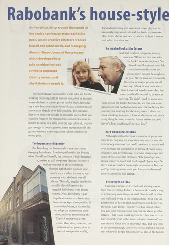
peak, we ask creative directors Frances
take an objective look
at what a corporate
identity means, and
why Rabobank needs it.
Newell and JohnSorrell, and managing
director Simon Jones, of the company
which developed it to
An inspired look at the future
Hard-edged presentation
The importance of identity
Believing in an idea
Rabobank's
house-style
focused marketing and communication plays an in-
creasingly important role and the bank has to make
clear to its clients just exactly who it is, how it works
and what its values are.
And that is where corporate identity
"V. comes in. 'When we first met with
the bank,' says Simon Jones, 'we
found that Rabobank itself feit
a need to consolidate its po-
sition, move on, not be caught in
its past. We've seen internationally
that a lot of major players are all
evolving. I think it was quite clear
that Rabobank needed to evolve, but
J""n ior'ell more specifically needed to be seen as
evolving. We didn't need to know any-
thing about the bank's fortunes to see this was an or-
ganization that needed to move on. The tools they had
just weren't working for them anymore. I think the
bank is taking an inspired look at the future and that's
a key thing because when the future arrivés and you
haven't done anything, it's far too late.'
Although within the bank a number of programs
have been ongoing for some time to ensure it was the
kind of organization that could continue to match and
even surpass the competition in terms of client-focus,
efficiency and performance, its visual image expressed
none of these integral elements. 'The bank's presen
tation was very dated and hard-edged,' Jones says, 'so
there was certainly a house-style requirement.But you
can't get into symbols until you have a fundamental
idea to symbolize and reflect.'
For Rabobankers around the world who are busily
working on hiking upthat bottom line, often in markets
where the bank is a new player on the block, introduc-
ing a new house-style may seem Iike just another major
chore in an already over-full schedule. The manuals
that have been sent out are so minutely precise that you
could be forgiven for thinking this almost obsessive at-
tention to detail is a little over the top. After all, you've
got enough to do just getting name recognition off the
ground without worrying about colour schemes for
memo pads.
But launching the house-style is not only about
changing letterheads. A whole philosophy lies behind
what Newell and Sorrell, the company which designed
it, prefers to call corporate identity. Extensive
market research in the Netherlands
showed Rabobank's old logo just
didn't hack it when it came to ex-
pressing what the bank was all
about. The cold, angular symbol in
a chilly blue did little to dis-
tinguish Rabobank from all the
others. Now, Rabobank is per-
haps best known as a bank that
has always kept a low profile. In
terms of publicity, it has tended
to adopt an unassuming posi-
tion, and even mentioning the
Triple-A rating was a rare
event. Over time, however, the
realization has grown that in
today's competitive world,
Creating a house-style is not just sticking a new
logo on everything. In fact, a house-style is only a way
of expressing something essential that should be alive
and well and living in the organization. 'So it was im
portant for us first to find, understand and believe in
the idea,' says Jones. 'You have to buy into it before
you can start making value judgements about graphic
images. That is our usual approach. Then you have to
ask yourself: what is the nature of our customers' fu
ture desire? Once you've answered that, and you look
at the current image, you try to crystal-ball it a bit and
say: what will people find attractive, also in the future?